How to build the perfect sign-up page
20+ examples from leaders like Notion, Clickup, and Figma...
In the highly competitive world of SaaS, your sign-up page can serve as a make-or-break touchpoint in the customer acquisition journey.
It’s more than just an entry point to your product. It’s your opportunity to instill confidence, present your value proposition effectively, and nudge users to make the move from prospects to engaged users.
Today, let’s explore how to craft a perfect sign-up page for your SaaS product.
Should the page be blank?
The common misconception that the sign-up page should be devoid of content, featuring only the necessary form fields, is often a lost opportunity.
While it is crucial to ensure a smooth and unobstructed sign-up process, the way I see it is that the page should do more than just collect user data.
It should convey your product's value, highlight its benefits, and demonstrate social proof.
It's all about striking a balance between simplicity, relevance, and persuasiveness.
The reality is that many people click “Get started” or “Try now” before they’re ready to create an account. Sometimes it’s out of curiosity to see where the CTA leads and other times it could be because they’re just clicking around your site.
Either way, in these situations, a little bit of extra boost around your product’s value can pull them towards creating an account and actually trying out the product.
We’ve all experienced that feeling when signing up to a new product to try it out and you’re second guessing yourself if it’s really worth the effort or all the follow up emails you’re going to get.
It may sound like a small thing, but all of these micro-friction points contribute towards the overall user experience.
What should you include?
Every company, product, and target audience are going to have their own nuances and preferences in the way they think and engage and so there is no one-size-fits-all template.
However, there are definitely best practices that we can learn from the leaders in the game.
Evaluating your sign-up page through a simple system can help quantify its effectiveness and guides optimization efforts.
The system I use focuses on three main pillars - Trust, Motivation, and Education.
For each pillar, evaluate your page based on the presence and effectiveness of related elements.
I’ve spent hours analyzing hundreds of SaaS companies and I’ve broken it down into 5 core elements that can be used to help you evaluate your page based off the above 3 pillars:
Testimonials/Social Proof
Product Previews
Value Propositions
Plan/Feature Descriptions
Home-page pop up
Let’s look at each one with some examples.
Testimonials/Social Proof
Incorporate logos of your best clients, testimonials, or case studies as forms of social proof on your sign-up page. This strengthens your credibility, builds trust with your new users and increases motivation to get started.
Examples: Vidyard and Lusha
Vidyard: Share an exciting customer testimonial + Include a picture to humanize the entire experience. Nothing like a friendly face to start building trust with new users.
Lusha: Got customers that you’re super proud of? Let people know! Seeing that top companies already trust a product can give users that extra nudge they need to sign up.
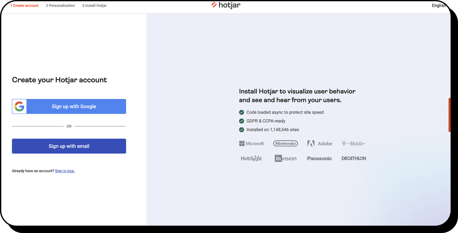
Hotjar also leverages some exciting numbers that show off how successful they are “Installed on 1,148,546 sites”
Plans/Features Description
Clearly outline which features users will gain access to and for how long. This can be a determining factor for prospects on the fence about signing up. This can also make users aware of other features/benefits that they’ll be getting by signing up.
Examples: Twilio, Krisp, Zapier, and Calendly
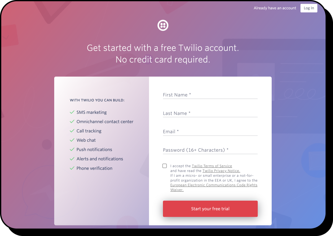
Twilio lets users know how many cool things they’ll be able to do once they get set up.
Simple and powerful - “With Twilio You Can Build:”
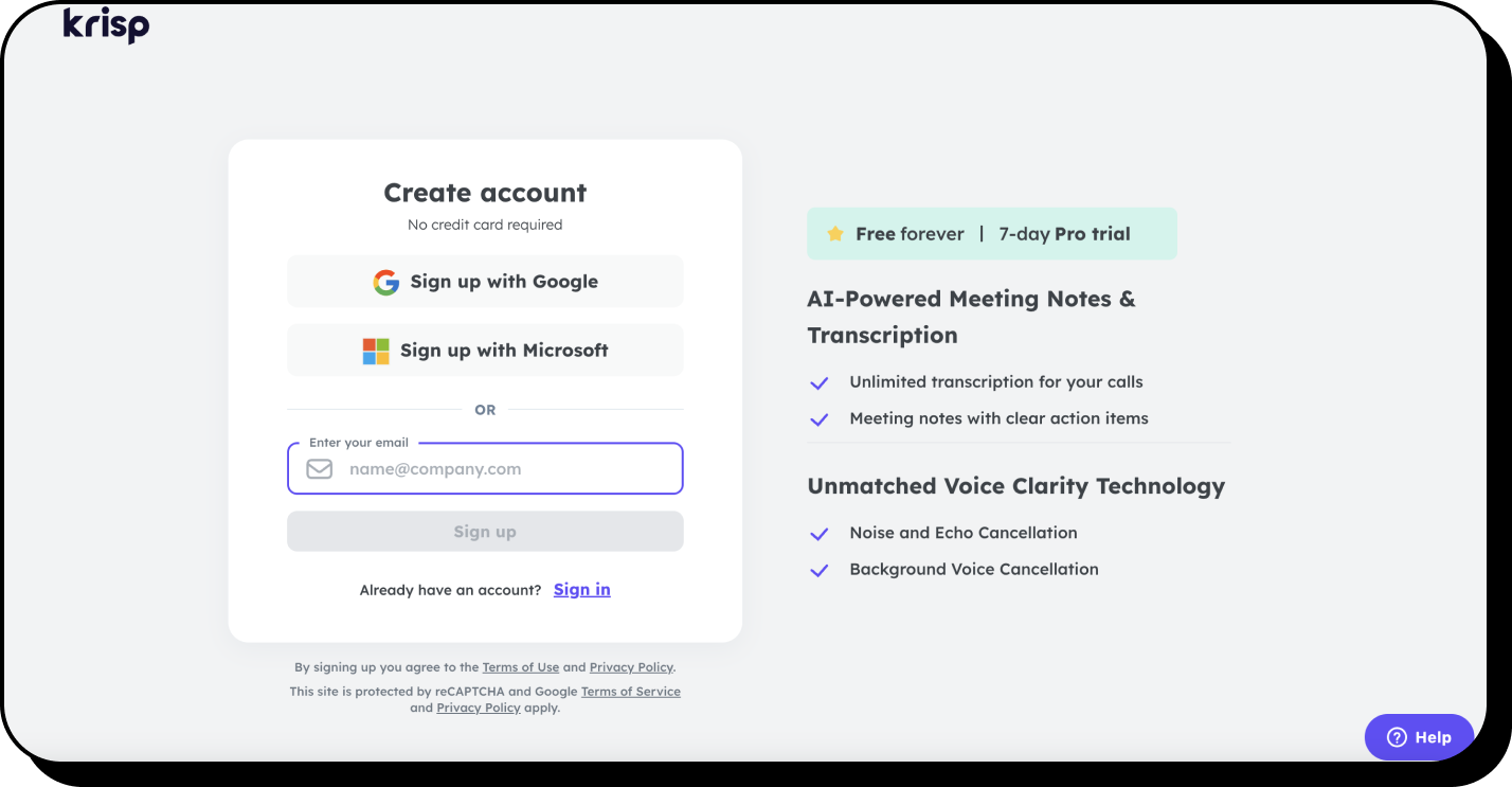
Help users understand the access they’re about to get. Krisp makes it easy to understand that they’ll be able to stay on the free plan, but for 7 days they’re also going to be able to access all Pro features - “Free forever | 7-day Pro trial”.
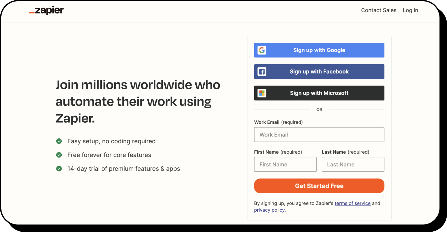
Zapier uses a very similar approach.
Users might not be aware of which features they’ll get access to when they sign up. Calendly makes it easy for them to know what their plan/trial includes.
Product Previews
A sneak peek into the product interface can stir up excitement and anticipation in new users + it gives users a better sense of what they’ll be able to do as they get started.
Examples: ClickUp, Zendesk, Webflow, and Typeform
ClickUp and Zendesk brilliantly teases new users with a slightly faded background that shows the product. This removes so much friction by making users feel like they’re just one click away.
Webflow takes a similar approach but shows a side preview of the product in action instead.
Another great way to excite users about your product is to show off what it can build. Typeform adds a minimal yet elegant design of an example question in a form. This helps users think, “Ooh I want to make something like that!”
Value Proposition:
Your value proposition should be clear and compelling on your sign-up page. It's your easiest chance to remind users why they should sign up.
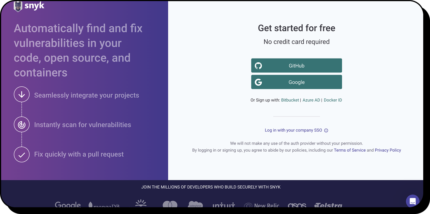
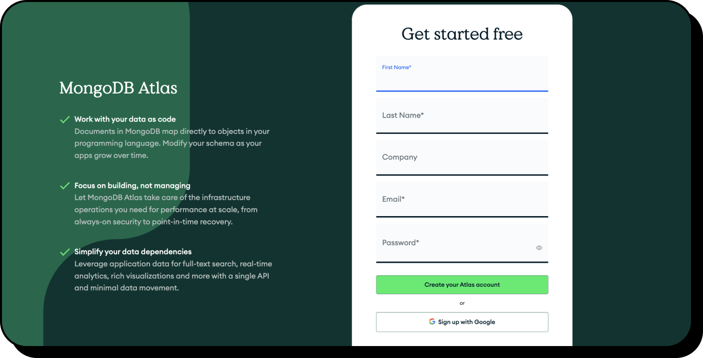
Examples: Snyk and MongoDB
Both Snyk and MongoDB take the opportunity to remind users about the value they could get by signing up. A clear and motivating value proposition could be the reminder that an exploring user needs to hear before they commit to giving your product a try.
Home-page pop up
A well-executed pop-up sign-up form on your homepage can offer a seamless user experience. This way, you don't distract your visitors from your main content.
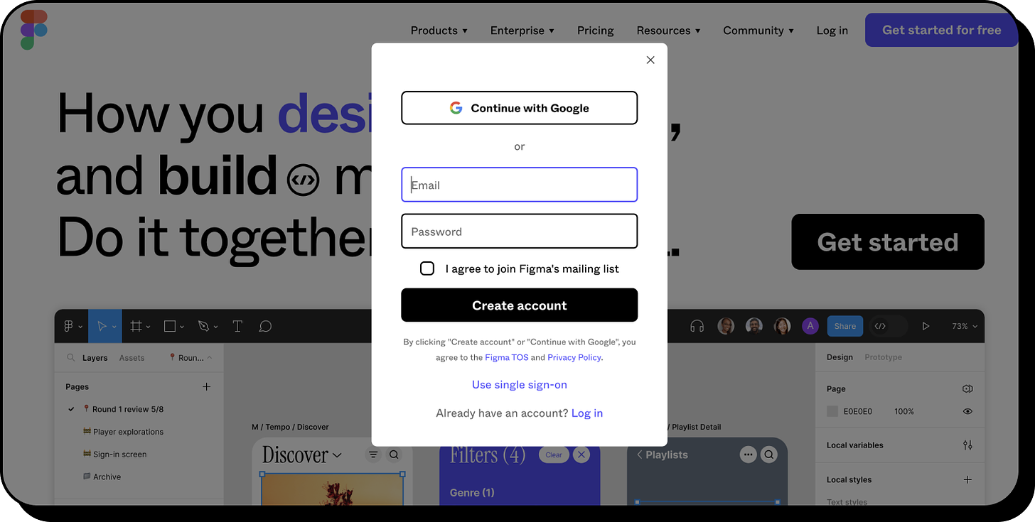
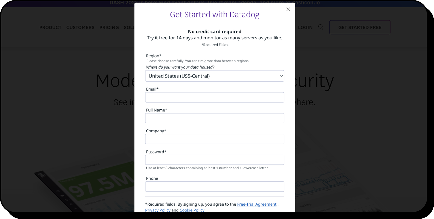
Examples: Canva, Figma, Datadog, and Apollo
Canva, Figma, and Datadog, all have a simple pop up directly from their home-pages. It’s quick, easy, and allows users to still see/access all of the other content that you’ve spent a lot of thought and effort preparing for your home-page.
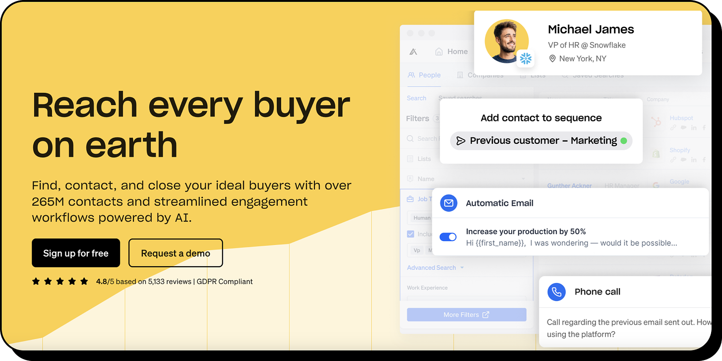
Apollo uses a slightly different approach - When you click “Sign up for free”, the page slightly changes into a form and Google/Microsoft sign up options. See the before and after below.
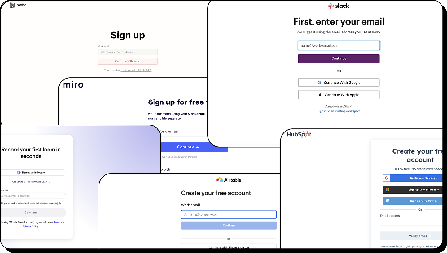
Or maybe scrap all of those ideas, and leave it completely blank?
I know, we’ve just seen some wonderful examples of powerful sign-up pages and in my humble opinion this is for sure the way to do it.
But.
There are plenty of SaaS leaders that have decided to go with the blank approach.
Examples: Notion, Slack, Loom, Airtable, Hubspot, Miro and many more…
I’d love to hear your thoughts, which way do you think is better??
Conclusion
Crafting the perfect sign-up page is an art that marries UX/UI design principles, persuasive copywriting, and a deep understanding of your target users.
Whether you opt for a design rich with information, testimonials, and previews, or prefer to keep it minimalistic with a solitary CTA, always remember that the key to a successful sign-up page is to offer clarity, build credibility, and continually emphasize your product's unique value proposition.
Thanks for reading!
See you next week :)


